The Impact of Color Psychology on Window Treatment
Window treatments are an integral part of any interior design project, providing functionality, privacy, light control, and an elegant touch to your living space. Yet, one aspect of window coverings that often goes overlooked is the impact of color psychology on the overall ambiance of your home. The colors you choose for your blinds, shutters, shades, or draperies can significantly influence the way your rooms feel and the mood they inspire. To create an ideal living environment that truly encapsulates your personal preferences, it's essential to understand the role that color psychology plays in choosing the perfect window treatments.
As a window treatment company, we specialize in offering various blinds, shutters, shades, and draperies in a wide range of colors, materials, and styles that cater to different tastes and requirements. We understand that the perfect window treatments serve users functionally and aesthetically, enhancing the overall home experience. Through this article, we will delve into the world of color psychology and offer valuable tips and tricks on how to choose the right hues for your window treatments.
Common Window Treatment Colors and Their Psychological Effects
Before diving into color combinations and strategies for selecting the perfect hues, let's explore the psychological effects of common colors utilized in window treatments:
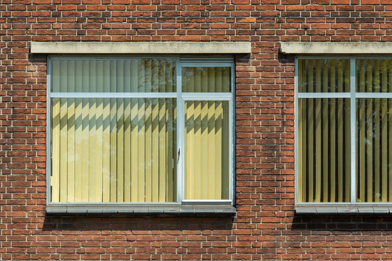
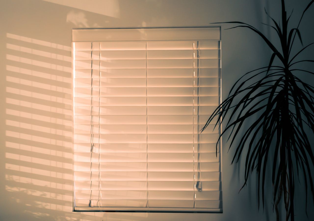
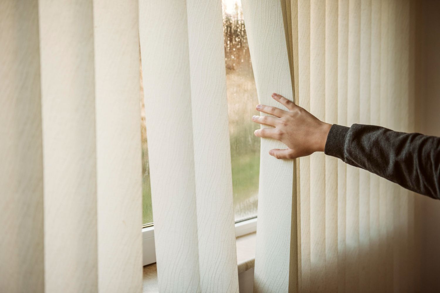
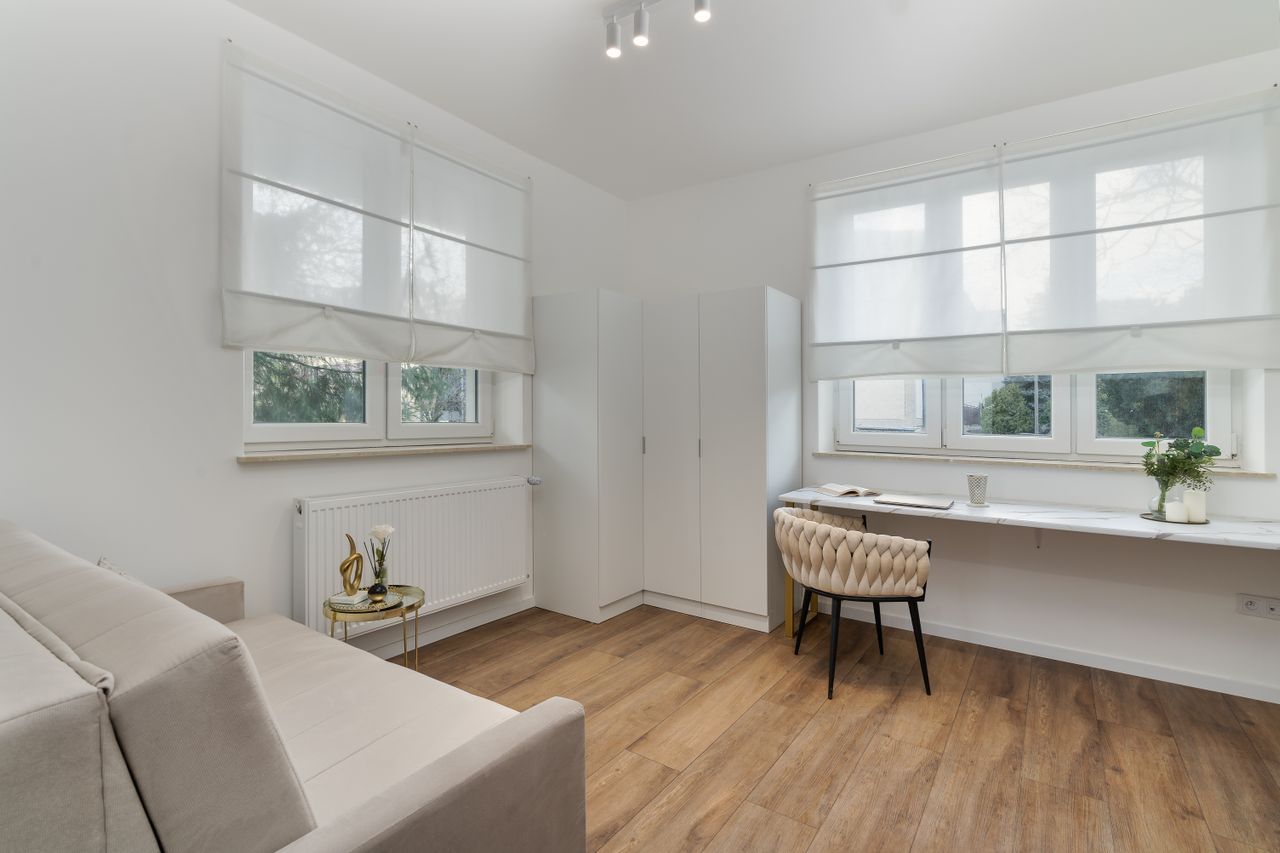
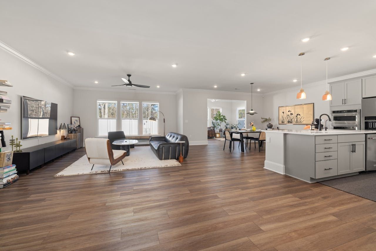
1. White: White represents purity, cleanliness, and simplicity. It can create a sense of space in smaller rooms and is a popular choice for window treatments due to its neutrality and versatility.
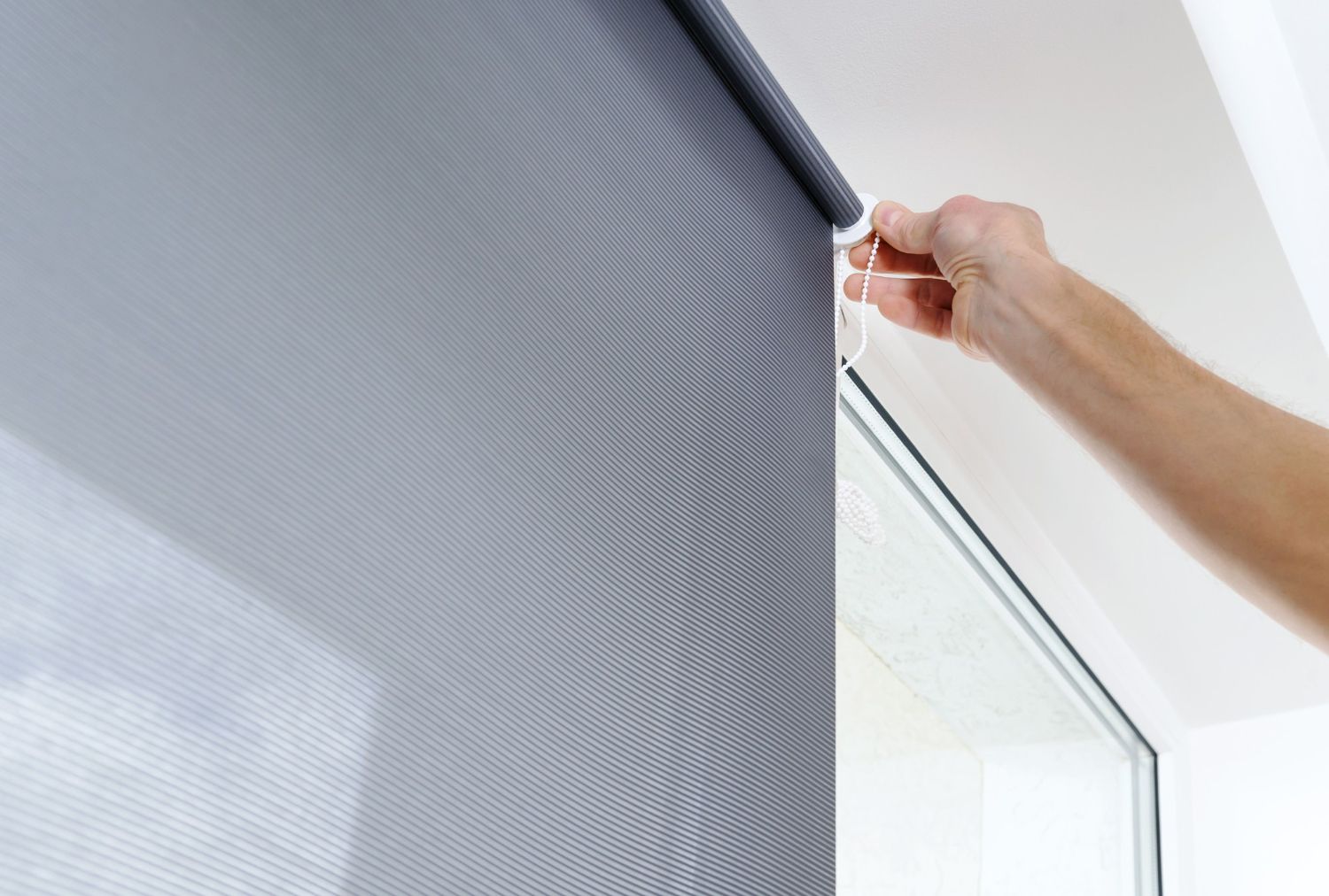
2. Gray: Gray is a sophisticated and elegant color that exudes a sense of stability and balance. It's an excellent choice for modern and minimalist interiors and works well as a base for more vibrant accent colors.
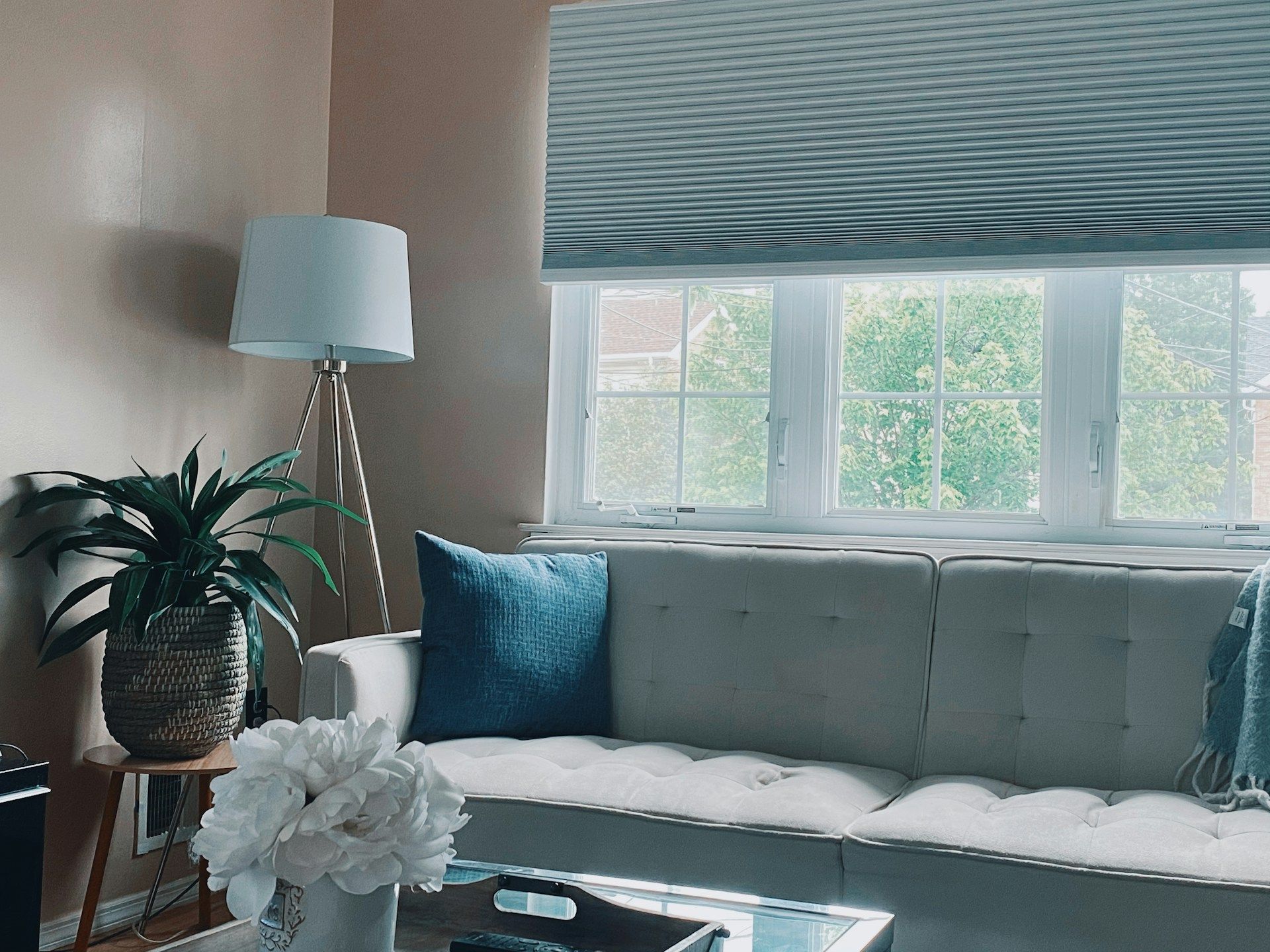
3. Blue: Blue evokes feelings of peace, tranquility, and relaxation, making it an ideal choice for bedrooms, bathrooms, and other areas where a serene atmosphere is preferred.
4. Green: Symbolizing nature and growth, green can create a soothing and refreshing atmosphere. It's known to promote relaxation and is well-suited for spaces where rest and rejuvenation are important, such as living rooms or home offices.
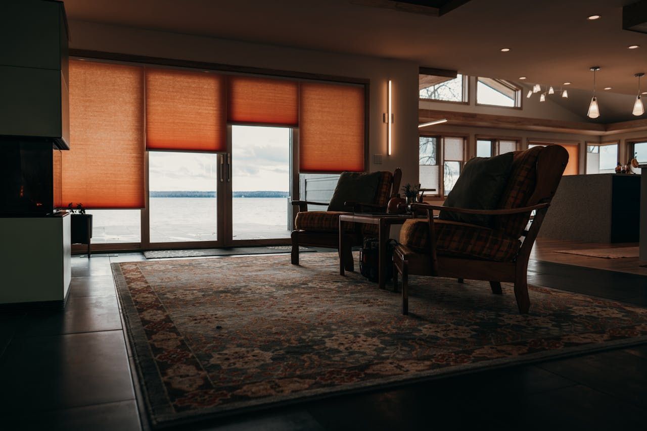
5. Yellow: Associated with energy, joy, and warmth, yellow can instantly brighten up a room and add a splash of cheerfulness. Use caution, however, as excessive yellow may feel overwhelming.
Tips for Choosing the Right Colors for Your Window Treatments
When selecting colors for your window treatments, consider the following tips to create a cohesive and harmonious space:
1. Start with the room's purpose: Determine the primary function of the room and the mood you want to evoke. Opt for relaxing colors like blue or green in restful spaces like bedrooms and energetic hues like yellow or orange in lively areas such as kitchens.
2. Assess the room's size and natural light: Lighter colors can make a smaller space appear larger, while darker shades create a cozy and intimate atmosphere. Additionally, consider the amount of sunlight the room receives and how the color may look under varying lighting conditions.
3. Coordinate with existing décor: To ensure a cohesive design, take into account the colors and patterns of your furniture, wall paint, and accessories. Your window treatments should complement the overall color scheme without clashing or overwhelming the space.
4. Test samples: Before committing to a specific color, request swatches or samples to visualize how they would look in your space. This helps you make a more informed decision and avoid costly mistakes.
Mixing and Matching Colors for a Dynamic Living Space
While some homeowners prefer uniform window treatments throughout their homes, others thrive on variety and contrast. Here are some ideas on how to mix and match colors for a dynamic and visually engaging living space:
1. Consider a monochromatic scheme: Choose various shades and tints of a single color to create a sleek and cohesive ambiance in your home.
2. Opt for complementary colors: Select colors that are opposite each other on the color wheel, such as blue and orange or red and green. Complementary colors help create a striking and vibrant contrast.
3. Experiment with analogous colors: Analogous colors sit side by side on the color wheel and can create a harmonious and soothing effect, such as a mix of blue, green, and yellow.
4. Use a triadic color scheme: Triadic color schemes involve three colors that are evenly spaced around the color wheel, like red, blue, and yellow. This approach creates a balanced and visually appealing contrast.
Embracing Color Psychology in Motorized Window Treatments
As motorized window treatment options continue to grow in popularity, don't forget to factor color psychology into your selection process. Motorized blinds, shades, and draperies offer the convenience of automation while still allowing for complete customization in terms of color and fabric choice. By incorporating the principles of color psychology, you can enhance the atmosphere and functionality of your home with the latest technology in window treatment solutions.
Conclusion
The power of color psychology in window treatments cannot be understated. By carefully selecting the right hues for your blinds, shutters, shades, or draperies, you can create a living space that complements your personal style, meets your functional needs, and fosters the desired ambiance in your home. Pay close attention to the psychological effects of various colors and use the tips provided in this article to make well-informed decisions that result in a stunning and inspiring living space.
Ready to explore the world of colors and find the perfect
window treatments for your home? Contact us at Southern Maryland Custom Blinds today to get started. Our team of experts is eager to help you uncover the beauty and power of color psychology in transforming your home into a true sanctuary of comfort, style, and well-being.
Share This Blog